Hi there! 👋🏽 I’m Sarah
Right now I'm probably...

Welcome to my portfolioI'm a UX/UI designer, writer, & researcher with an appreciation for the written word.I’ve collaborated with startups, agencies, and established companies to transform their innovative concepts into cohesive, story-driven experiences.Currently @ 3:5 Creatives.
Glo Mirror
Beauty smart mirror with tutorials, product recommendations, and a skincare tracker
Ulrich University Writing Center
Reimagining the appointment-making process for a university writing center
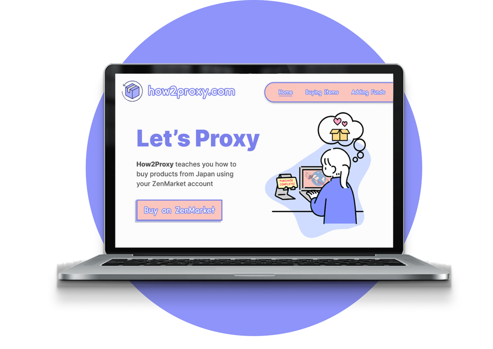

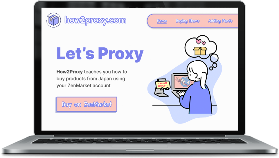
How2Proxy is a prototype that teaches users how to buy products from Japan using a reputable proxy service called ZenMarket.
Role
User Interface Designer
Duration
Sept - Oct 2022
(6 weeks)
Team
Individual
Tools
Figma, Photoshop
Project Overview
This prototype was created as the final project of a User Interface Design II course using the prompt: create an app that teaches users something new.After submitting a proposal, designers were tasked with creating a tutorial prototype that incorporated 20 user interface (UI) and interaction design principles.
Goals
• Incorporate user interface concepts to create an effective instructional tutorial
• Produce an intuitive interface that allows a smooth navigational experience
• Reflect on peer and instructor feedback by making changes in a timely manner
Process
Written Proposal
Designers began by writing a one-page proposal and submitting it to the instructor for approval.
Project Development
After finalizing their proposal, designers created a prototype that incorporated 20 UI principles
Revision/Refinement
Designers received 3 - 4 rounds of critique from the instructor and peers and made revisions
User Interface Principles
This project incorporates 20 user interface design principles. A sampling of those concepts is featured below.
Miller's Law
Definition 🔍
Humans can only process seven (plus or minus two) items in their short-term memory at a time.
How the Principle is Used 🧠
Both tutorials in the How2Proxy app are no longer than 7 steps each, which makes the steps easier to memorize.

Multimedia Principle
Definition 🔍
Users learn better when instructional text is paired with images, as opposed to only using text.
How the Principle is Used 🧠
Screenshots of ZenMarket (the proxy website used) are included during each step of the tutorial to help users understand textual instructions.

Signaling Principle
Definition 🔍
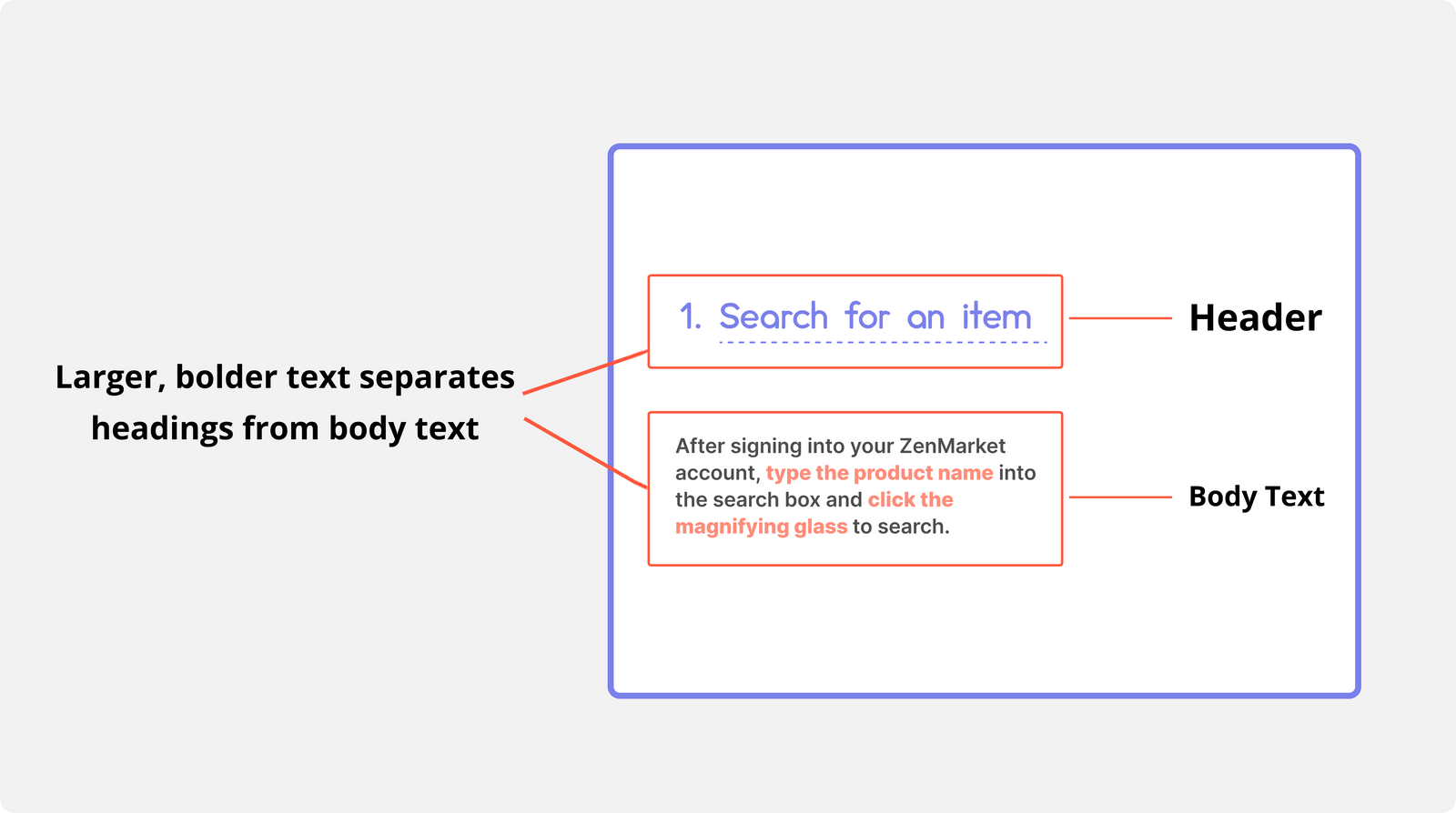
People learn better when a design uses cues that emphasize the organization of essential information.
How the Principle is Used 🧠
Tutorial step names are enlarged/bolded (i.e.: "Search for an item"). This helps users recognize these headings as organizational information.
Zeigarnik Principle
Definition 🔍
Users tend to remember incomplete tasks more than complete ones.
How the Principle is Used 🧠
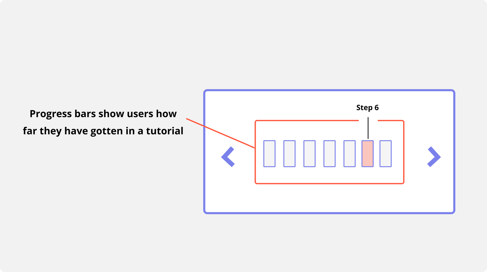
Including a progress bar at the bottom of the page shows users how much of the tutorial has been completed and how much is left, prompting them to complete the entire tutorial.

Challenges & Lessons
Learned
By incorporating the 20 UI design principles learned in class, I was able to create How2Proxy—an intuitive app prototype that teaches users how to use ZenMarket.
1.
Applying Feedback
While creating this prototype, I received several rounds of feedback from both my professor and my peers. In order to make the interface organized, navigational, and visually appealing, I had to understand the given feedback and pay meticulous attention to applying it.This process has honed my ability to interpret and act on feedback, a skill that will be invaluable in future projects. By effectively incorporating client and team input, I will be better equipped to meet diverse needs and deliver polished, user-centered solutions for both clients and companies.
2.
Practical Design and Application
Creating this project allowed me to integrate vivid visuals with well-established user interface principles, resulting in a seamless instructional experience. This hands-on experience has sharpened my ability to blend aesthetics with functionality, a skill that will be crucial for refining my designs and prototypes in future projects.
PayBack
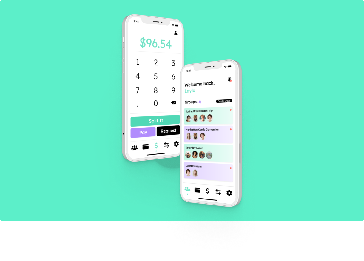
An app that allows users to easily split payments amongst a group
Overview
PayBack is an app that allows users to easily split payments amongst a group of people.
*Note: Although this project was completed as part of a UX Design class at my university, we considered business goals and stakeholder needs throughout the process to better understand how to handle these scenarios in professional settings.
Info
Role:
Ideation, UI Design, UX Research, Branding
Team (Original):
Sarah Subero, Nicole Kadom, Mikayla Martin, Lauren Deloach,
Hala Canada(Redesign - Currently in Progress):
Sarah Subero
Duration:
8 weeks
Methodology:
Lean UX
Tools:
Figma, FigJam, Photoshop
Problem
Although payment services like PayPal and CashApp allow groups to split payments, it's often difficult to split large payments in unconventional ways due to limited customization options.
Outcome
We prototyped an app that allows users to create groups for both single and recurring events, specify the amount (or percentage) each member must pay, and set up payment reminders.
Understanding the Problem
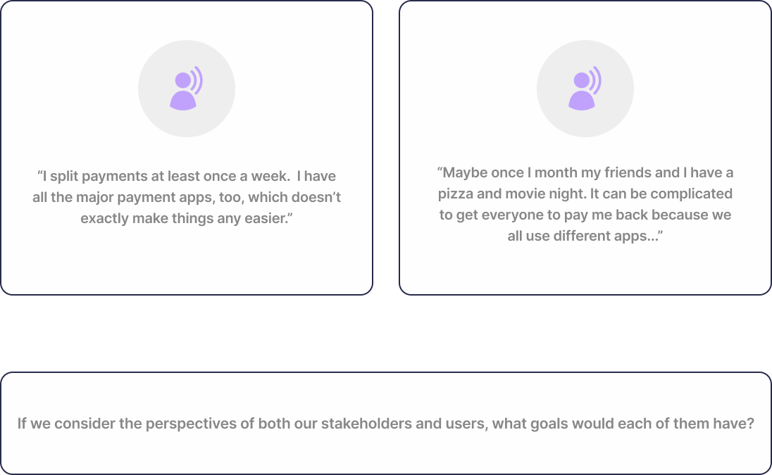
The Challenge 🧩Digitally splitting payments amongst a group can be restrictive. Although apps like PayPal and CashApp offer group payment options, it's often difficult to split large payments in unconventional ways (such as a 70-30 split). Additionally, setting up payments for repeat weekly or monthly events can be a hassle.Users need an easy way to split payments unevenly and a way to set up recurring payments.
Our Goals for This App 🎯Business Goal: Determine the metrics that would prove this app is a financial success.Usability Goal: Implement a design that best allows users to create groups and split customizable sums amongst the members.
Hypothesizing Business Needs
What is Lean UX? 🔍For this project, my team used a design process called Lean UX. Developed by organizational designers Jeff Gothelf and Josh Seiden, this methodology begins with the idea that "everything is an assumption until proven otherwise."Each member of the team generates assumptions about the product's users and documents these assumptions as hypotheses (testable statements). Then, the team validates or invalidates these hypotheses using a basic version of the product (called an minimum viable product or MVP). Next, the MVP is used to gather feedback and guide the product's redesign.The iterative process of generating and testing assumptions can be done as many times as needed; however, due to this class' short duration, we adapted Lean UX to fit within a two-month deadline.
Discovering Business Goals with Outcome-to-Impact Mapping 🧠Lean UX bases success on solving stakeholder and client problems.We had already identified our problem (splitting payments digitally amongst a group is limiting) and outlined our solution (prototype an app that enables easier, customizable, and recurring money transfers).Now we had to ask: what would success look like from a business perspective?Profit and customer satisifaction are the most obvious indicators of success, but we needed to break those ideas down further.We created an Outcome-to-Impact chart that showed us which observable behaviors would prove that our business goals were being met (shown below).
*Note: Since this prototype was not intended for official development, this exercise was completed to fasciliate our understanding of business processes from a design perspective.
Hypothesizing Our Users

*Note: Information has been gathered from CashApp, Venmo, and PayPal reportings and Statista.com.
Understanding Our App's Demographic 🔍The next step was to define who would be using our app by creating proto-personas, which are used in the Lean UX metholodgy. Unlike regular personas, proto-personas are not based on extensive research but on limited research and initial assumptions, which are later validated or refined through further testing.The research conducted during this stage showed that our target demographic was between the ages of 18-34 (young and new adults)
Primary Proto-Persona 👤Our primary proto-persona was Layla Henderson, a college freshman who spent her money on outings with friends and necessities for her dorm.
Hypothesizing Our Users' Needs
Gauging Success With User Behaviors 📋After defining who might use our app and why, we asked ourselves additional questions that would help direct our design process and discussed our insights. One such example:Question: What would success feel like as a user?Answer: Success would feel like a sense of accomplishment and security. Users would achieve their goals smoothly and effortlessly through the app, while knowing their financial information is being handled safely and reliably.(Full questions are shown below).
What Did We Discover? 🔍My team hypothesized that our users' main goal is to easily split payments in a group. They want to feel a sense of accomplishment and security from this process, and we can evoke these emotions using a steamlined process that emphasizes safety and ease of use.Key user behaviors that indicate our success include:• Positive app store/playstore reviews• Consistent and increased use of the product overtime• High volume of processed transactions
Brainstorming Problems and Solutions 💭Our next step involved brainstorming the potential challenges users might face using our app and then identifying possible solutions.Example Possible Problem: How will users find their friends in the app to create groups and send/receive money?Example Possible Solution: A searchable contacts list will be implemented where users can be located by email and/or phone number.
After discussing as a team, we established that the main features users needed was a:• Searchable contact list to find other users
• Portal to send and receive payments
• Method for securing their dataA sample of our process is on the left.
Determining What To Build First
Organizing Our Hypotheses 🗂️After determining potential problems and solutions, our next step in Lean UX was to rank our solutions from "most risky" to "least risky.""High risk" solutions would be the most time-consuming, as we would need to conduct extensive research and testing to solve these particular problems. These risks would often result in MVPs (minimum viable products)—the smallest thing we could create to receive the most feedback."Low risk" solutions would be easier to confirm and would not require as much research.The "Send Money" feature was one of the riskiest features because it dealt with user security—a field in which none of us had significant expertise.Even if the user securely linked their bank/card, how would we reduce the possibility of them sending money to the wrong person?
Creating an MVP 📝We proposed two solutions to that challenge:• Request permission to access a user's contact list
In this way, the "Send Money" feature would be populated automatically with their contacts, reducing the possibility of sending money to the wrong person.
• Only allow users to send money to verified accounts
Accounts would have to be verified with a phone number. If left unverified, a user would only have limited access to app features and would be unable to send and receive money.A verified account would be tied to a confirmed phone number, thus reducing the chance of a user sending money to the wrong person.
I built out these features in the form of low-fidelity wireframes (shown below). Later on, these wireframes would be shown to our interviewees for feedback and testing.
Wireframing
The Wireframing Process 📐With the groundwork laid, each team member was assigned specific screens to create low-fidelity wireframes. Stand-up meetings were held every 2 days to track progress and address concerns.Once the wireframes were done, they would be shown to potential users for feedback and refinement.
Wireframing the "Split a Payment" Feature 💸During this stage, I was responsible for designing the "Split a Payment" feature, which was a key function of the app.This feature would allow users to create a group, add members, specify the amount of money to be split, and then proceed with the payment distribution.Below is my wireframes for these features.
*Note: Clicking the image and opening it in a new tab will enable maximum zoom.
User Testing & Affinity Maps
Interviewing Our User Base ✍️While we were still in the process of wireframing, we conducted 4 user interviews that allowed us to ask questions about our app's domain (cash-transfer apps) and get feedback on our wireframes.Our interviewees were in our target demographic (young adults) and used one or more cash-transfer apps like Zelle, CashApp, PayPal, or Venmo.Despite these similarities, our interviewees came from many different racial and ethnic backgrounds, which provided us with a wealth of different experiences.As a team, we constructed a pool of interview questions to help us understand how our interviewees used similar cash-transfer apps and what they would expect from using ours.
Grouping Similarities in Affinity Maps 🗺️After each interview, my team gathered our notes into an affinity map where the observations and user behaviors that overlapped with one another were grouped together in clusters. This way, we could see which behaviors appeared most often in our interviews. While our sample size was small, most of them shared similar behaviors.We discovered:• Most users utilize payment apps on a weekly basis (mostly with friends)• Security was more important to older users than younger ones• Two-factor authentication was the preferred method of security among all users• More than 50% of users kept money in their account and didn't transfer to their bank
What Did We Get Right? ✅After conducting our interviews, we noticed there were several things we got right about our user base and our wireframes:
• Most users utilized at least 2-3 payment apps because a single app couldn't do everything they wanted• Users easily manuevered through the "Create a Group" and "Onboarding" wireframes, meaning they were easy to navigate• Users liked the idea of accounts requiring verification before sending money; some even liked the idea of requiring a passcode to be entered before sending money• Half of our users liked the idea of allowing access to their contact list• Our proto-persona Layla provided an accurate reprentation of our user base's wants and needs.
What Did This Mean? 🤔These insights meant we were on the right track with many of our design choices. Most of our wireframes were intuitive, which meant our app was easy to navigate and, by extention, easy to use.We were also correct in our assumptions on how to handle security risks.By creating and testing our app in small, bite-sized phases (as opposed to designing the entire app and then testing it), we received continuous feedback and avoided wasting time on features that would prove useless to our user base.
What Did We Get Wrong? 🚫Of course, there were also several things we got wrong about our users as well:
• All of our users kept money in their account (they did not immediately transfer money to their bank)• Users were initially confused about the difference between the "Splitting a Bill" and "Request Money" options on the wireframe• None of the interviewees used payment apps for work/business, only for leisure• Splitting payments was done almost solely between family and friends, not co-workers• None of our interviewees used payment apps to send gift cards (a feature we believed would be beneficial and added to our wireframes)
What Did This Mean? 🤔These insights showed us several changes we would have to make:1) We needed to implement a "Current Balance" feature that would show users how much money they had available on the app (as most users do not immediately transfer money to their account).2) We needed to better clarify or consolidate the "Splitting a Bill" and "Request Money" options when it came to splitting payments.3) We needed to rethink our proto-personas. Michael did not accurately represent our user base because most people we interviewed did not use payment apps for business purchases.4) We needed to get rid of the feature that allowed users to send gift cards; no one was interested in using this feature.
Revising Our Proto-Persona
Reassessing Our Secondary Proto-Persona 🔨During our interviews, we discovered that Michael, our secondary photo-persona, did not accurately represent our user base.None of our interviewees used cash-splitting apps for the business-related purposes Michael would have, nor did any of our personas split payments amongst their coworkers for business expenses.As a result, Layla became our only persona.
Restructuring Our Primary Proto-Persona 🔧Besides a new look, our primary proto-persona Layla remained mostly the same.Most of the changes to Layla focused on her behavior, refining it to better align with the attitudes of our interviewees.One such change regarded security. Security was not as much of a concern as we initially expected; however, most of our interviewees still desired to have some safety measures in place, such as two-factor authentication and restricting accounts until they were verified. These elements were incorporated into Layla's reworked design
(shown below).
Prototyping
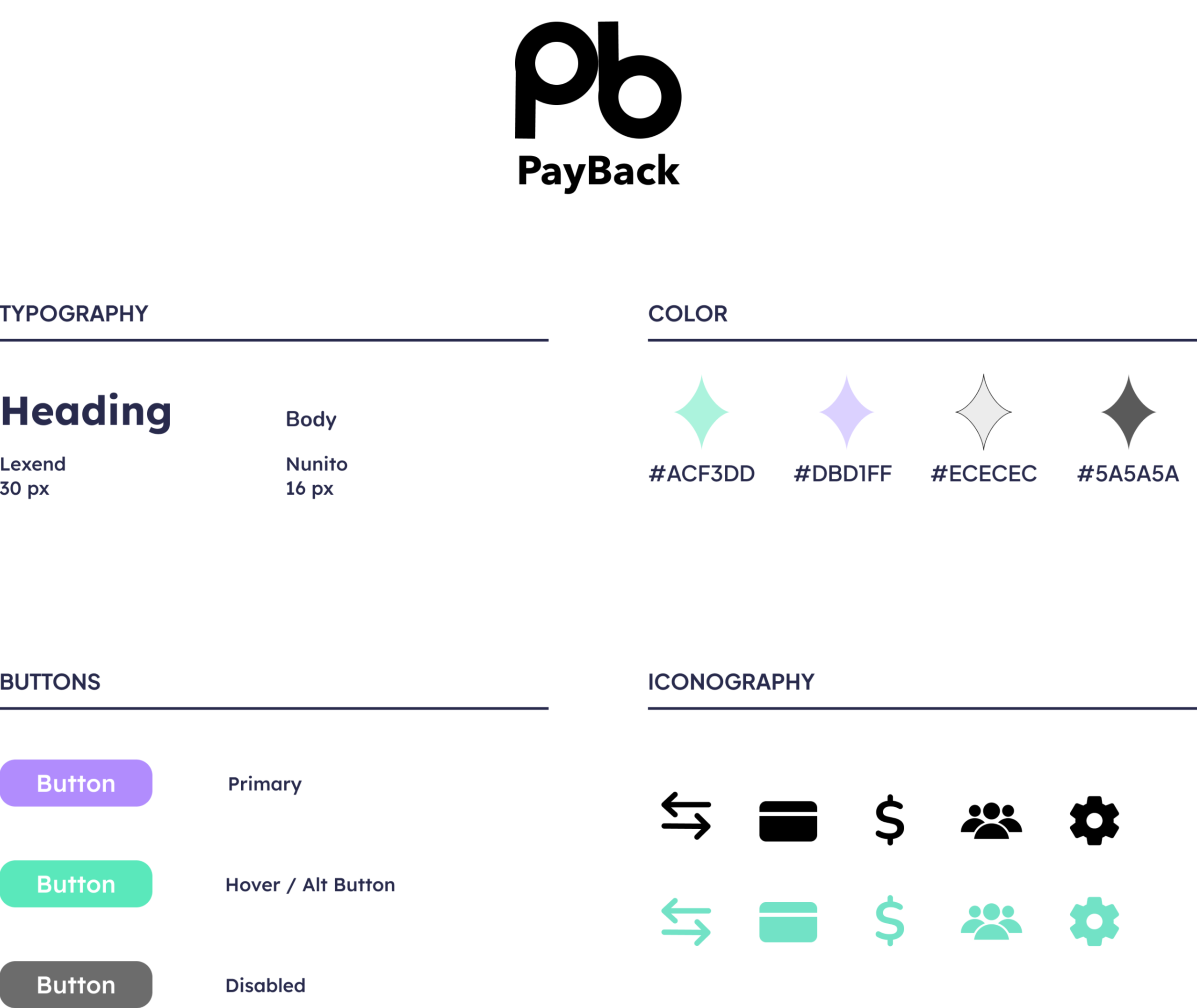
From Wireframing to Prototyping: Branding 🎨In a professional setting, we would typically spend more time revising low-fidelity wireframes and gathering feedback. However, due to class time constraints, we moved into the prototyping stage.During this stage, one other teammate and I began creating brand assets and components for the design (i.e.: dropdown menus, buttons, and icons).I designed the PayBack logo and chose the brand "aesthetic" of a simple yet classy diamond symbol that would become the hallmark of the PayBack brand (shown below).
Performing Additional Testing Using TAP 🧪As we built out our prototypes, we simultaneously conducted 8 more user interviews, bringing us to 16 interviews total.During these interviews, we conducted usability tests on our prototypes using a testing method called the think-aloud protocol (TAP).This method involved testers performing tasks like "creating a group" or "requesting money from a user" and explaining their actions aloud as they completed them.The feedback we received during these tests allowed us to understand where our design choices were unclear and required alterations. As before, each interview was followed by an affinity mapping session to help us find patterns of behavior among our interviewees.
Design System
Design Exploration
The PayBack dashboard displays a user's groups and includes a "Create Group" button for adding new ones.My team believed this screen was the main focus of the entire app and decided to make it our dashboard.
Retrospective
Challenges & Lessons
Learned
This was my first experience using the Lean UX methodology, which was additionally challenging given our a tight timeframe.
1.
Understanding a Business PerspectiveThroughout this project, I gained valuable insights into how business metrics influence design decisions and the overall direction of a product. While user experience is crucial, it’s essential to align design with the broader goals and success indicators of the business. This often means balancing user needs with the company’s objectives.Understanding the key business metrics allowed me to approach the design with a more strategic mindset.Even though this project did not have actual stakeholders, this experience allowed me to understand the design process from a stakeholder and business perspective for future endeavors.
What would I do differently?
Be Stricter On CohesivenessOur team struggled to keep our final designs cohesive. This was likely due to only two members of the team (myself and the team lead) creating the design system.Our design would've been much more cohesive had we incorporated our grid layouts earlier on in the design process to make aligning headings and icons easier.
2.
Test Often - It Saves Time!We had very little time to transition from wireframing to high-fidelity designs due to the rigorous pace of our course. To our reluctance, we sometimes had to show ugly low-fidelity screens or unfinished sketches to our interviewees for feedback.While embarassing at first, doing this allowed us to receive valuable feedback immediately and detach ourselves from incorrect assumptions.This approach saved us significant time in the long run, as we were able to quickly discard design choices that didn’t resonate with our user base, rather than building them out only to discover they were unnecessary after ample work had already been put in.
🚧
Pardon our dust!
I am currently working on a redesign for this app.
This page will be updated upon completion.
This case study focuses on the research and original design of PayBack.
Click here to jump to the visual redesign.
🔁
My redesign of the PayBack app is beyond this point.
Overview
The PayBack redesign challenge aimed to resolve visual inconsistencies from the original app and include new insights.
Info
Role:
UI Design, UX Research
Duration:
2 day challenge
Tools:
Figma
Why Do a Redesign?
I've Grown as a Designer 🌱My team and I created PayBack when we were still fairly unfamilar with prototyping.Although we learned a lot from the experience and delivered a decent product, there was so much we could have done better.Since then, I've grown as a designer and decided to challenge myself to recreate the app by myself in two days.
What I Hope to Learn 💡• Advanced Prototyping Tools: I aim to deepen my knowledge of advanced prototyping tools in Figma, which allow for more efficient wireframe creation in the future.• Honed Visual Consistency: I plan to focus on creating a more cohesive visual design, minimizing inconsistencies to enhance user experience and brand identity.• Methods to Iterate More Efficiently: I hope to learn how to better balance speed with quality, making faster design iterations without compromising the user experience.
✅ What did we get right?
• Seamless Design Flows
The original design was intuitive and easy to follow. It flowed neatly and logically from one page to the next.
❌ What did we get wrong?
• Sloppy Spacing
The original design didn't use an 8-point grid (a mistake that contributed to poor spacing and inconsistency).
✨ What could be improved?
• Bulky, Blocky Design
Several elements on the original design were large and blocky, giving the design an amateur feel.
Major Findings 📋
1.
Incomplete info
When choosing a health insurance plan, people make decisions based on insufficient information.
2.
Unclear details
Information on health insurance plans are relayed in a confusing and inconsistent manner.
3.
Challenging process
Even after choosing a plan, finding in-network services & availability for patients can be difficult.
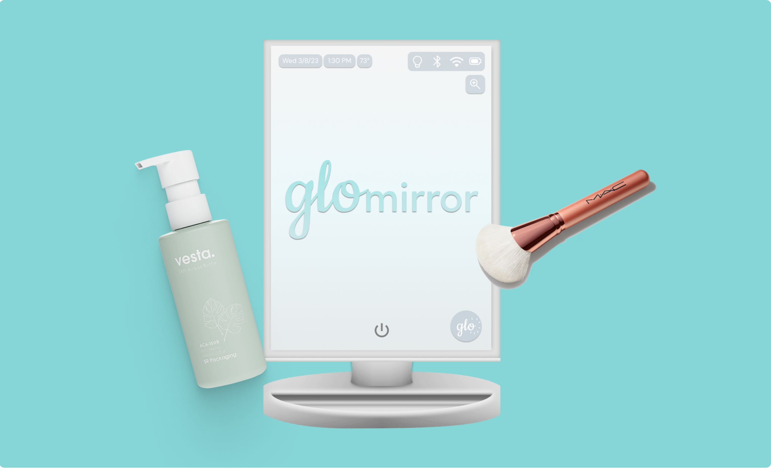
GloMirror
A beauty smart mirror with tutorials, product recommendations, and a skincare tracker
Overview
Glo is a smart mirror designed to simplify makeup and skincare routines with tutorials, product recommendations, and a skincare tracker
Info
Role:
Ideation, UI Design, UX Research
Team:
Sarah Subero, Jessie Wu, Nicole Kadom, Tyler Hayes, Keya Metha
Duration:
13 weeks
Methodology:
Goal-Directed Design
Tools:
Figma, FigJam, Discord
Problem
Many people lack confidence in their beauty skills and struggle to find products that suit their specific needs.This can sometimes result in a person using products that aren’t suitable for their skin or neglecting regular skincare routines, which may lead to undetected issues.
Outcome
We created a smart mirror prototype that gives users access to tutorials, product recommendations, and a "skincare tracker" to monitor the effectiveness of their chosen products.
Understanding the Problem

What is the Issue? ❓A 2022 study called "Choice Overload in Makeup Foundation" found that the vast amount of beauty products can (and has) led to choice paralysis in consumers. This is further exasperated by a lack of knowledge regarding which ingredients are beneficial and which aren't.As a result, shoppers may select harmful products that damage their skin without knowing which ones could actually improve it.How are we tackling this issue? 🔧With the seemingly endless amount of products available, we asked ourselves "how can we use technology—namely smart mirrors—to improve the makeup/skincare landscape?"
Competitive Analysis
Goals 🎯By looking at other smart mirrors on the market, we could:• Assess our product’s industry, the needs of its users, and the strengths/weaknesses of similar products• Evaluate the design patterns in similar products to adopt a recognizable layout that will appeal to potential users
Researching Similar Products 🪞We found and studied four different smart mirrors (Capstone Connected, Hilo, CareOS, and HiMirror) and compared their features to see what they offered to customers. Capstone Connected and Hilo were smart mirrors designed for general use, while CareOS and HiMirror targeted beauty and wellness.We discovered that HiMirror offered the most features of the four; however, online reviews indicated there were usability concerns such as the lack of an onboarding process and unclear instructions.
Discovering User Needs
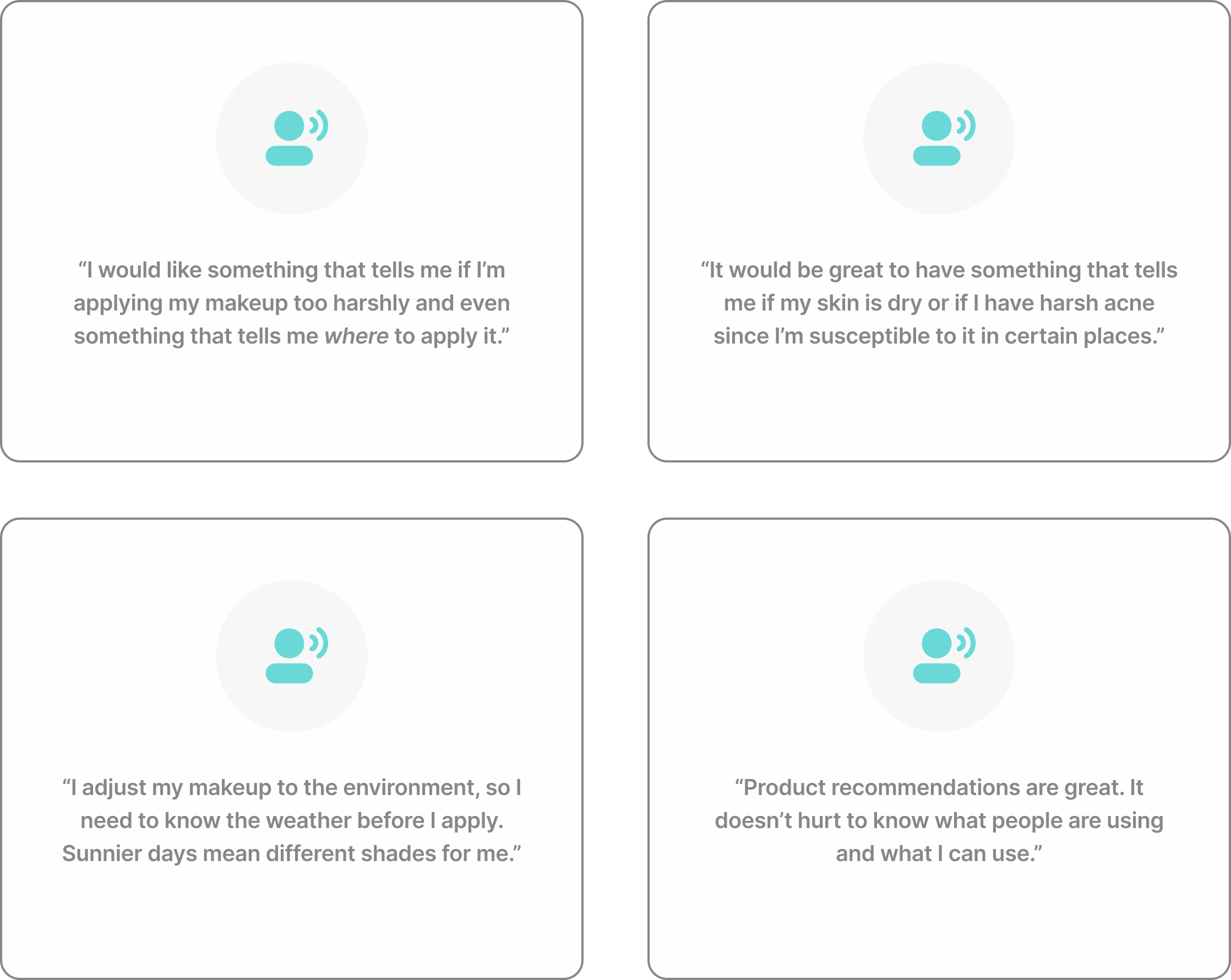
Research Findings 🔍After finishing our competitive analysis, we conducted 8 interviews to explore our potential users' concerns, needs, and desires for a beauty smart mirror.Our interviews revealed that potential users weren't just interested in skincare, but makeup as well, indicating the need to expand the scope of our product.*Regardless of their skill level or experience with cosmetics, users' biggest concern was receiving personalized assistance to enhance (or build) their beauty routines.Some needed guidance on improving their skin's overall appearance, while others needed help selecting the right shades for their complexion.
*Note: This case study will primarily focus on the skincare aspect of the prototype, as the majority of my tasks were related to that area.
Charting User Behaviors
Behavioral Variables 🔄After identifying each user’s unique needs and routines during their individual interviews, we grouped similar habits and categorized them as "Behavioral Variables." These variables helped predict how users would engage with our product and what they would want out of it, thus providing us valuable insights to guide the design process.For example, if most of our interviewees preferred using a table-top mirror over a wall-mounted one during their routine, our product should also be a table-top product to better align with our users' lifestyle behaviors.Some of the other variables we charted were:
• Makeup knowledge level (beginner vs intermediate vs expert)• Length of beauty routine (<5 min vs 30 mins+)• Do you like product recommendations? (yes vs no)
The behavioral variable chart is featured below.
What Did We Learn? 💬• Most participants did not share a mirror (thus a feature for creating multiple accounts was deemed unnecessary)
• There was no clear preference for or against product recommendations (we would include an on/off toggle for this feature)
• The majority completed their beauty routines using a table-top mirror (as a result, the mirror would be designed as a table-top product
• Knowing product ingredients was important to the majority of the participants (we would highlight product ingredients in our design)
• The majority considered doing their hair as a big part of their beauty routine (as a result, we had plans to recommend hair products as well; however, we were unable to build out this feature due to time constraints)
Behavioral Variables Chart
*Note: Behaviors were mapped by assigning each interviewee a number (1-8) and plotting them on a scale.Open the image in a new tab for largest view.
Crafting Personas
Distilling Our Users Into Personas 🧪After analyzing our data, we summarized the behaviors, preferences, and needs of our respondents using personas.We recognized two main user types for our product:1. Beginners
These users utilized cosmetics to enhance their appearance, but didn't know how to find (or apply) suitable products.
2. Intermediate
These users also used cosmetics to enhance their appearance, but they already had established routines. They were mostly seeking improvement.
Who is the Primary Persona? 📊Initially, we decided our primary users would be intermediate makeup users while our secondary users were beginners who wanted to learn the fundamentals of makeup. This seemed to go hand-in-hand with what we heard from our user interviews.However, after discussing as a group, we discovered that centering our product on intermediate users meant beginners might have difficulty using some of the product's advanced features. This was the same error that HiMirror (one of the smart mirrors we researched) made according to user reviews.To recify this, we decided to make beginners our primary persona. By addressing the needs of a beginner, we would also be addressing the needs of an intermediate user, ensuring neither group was overlooked.
Primary Persona 👤Our primary persona was Jamie Chamberlain, a college student learning to use makeup for the first time.
Secondary Persona 👤Our secondary persona was Tatiana Starr, a seasoned makeup-user that hoped to improve her skills and routine.
Context Scenarios
Context Scenario ✏️Next we needed to consider how our product would impact our users' daily lives. We developed a hypothetical scenario (called a context scenario) to define the actions they would take using the mirror, what tools they would use, and what features were required for effective use.We were able to answer questions about:• Setting (where the mirror would be used)
• Duration (how long it would be used)
• Associations (what other products would be used with it, if any)
Developing a Prototype
Skin Tracker Feature 🔬When it was time to prototype our mirror, I was responsible for developing the Skin Tracker feature. This feature identified problem areas on the skin and their severity, monitored skin conditions, and logged the results over several days.The image to the right breaks down the main sections and elements of the tracker.
What challenges did I face when creating this feature? 🧠
1.
Narrowing Down Concerns
Over 3,000 different types of skin conditions exist, how did I decide which ones to feature?
↓
Through additional research, I narrowed this extensive list to five of the most common concerns that are often targeted by cosmetic companies: acne, blackheads, dark circles, dryness, and fine lines.
2.
Communicating Results
How could the user tell if a problem area was improving or worsening over time?
↓
I implemented a color-coded line graph that displayed results as getting better or worse over time. Green meant the problem area had minimal presence on the user's face, yellow meant moderate, and red meant severe.
3.
Depicting a Comprehensive Overview
What if the user wants a comprehensive look at their skin health over time?
↓
I prototyped a calendar feature that auto-logged each day a user scanned their face. Clicking a date on the calendar displayed the skin analysis for that day along with the image that was taken during the analysis.
Design Exploration
A calendar view of the Skin Tracker allows users to select a specific day to get a comprehensive overview of their skin on that day.
Upon selecting a specific day, users are able to see the intensity of certain common skin conditions and how they improve or worsen (as indicated by the percentages and colors).
Usability Testing
Think-Aloud Protocol 🗣️Once our prototypes were complete, we conducted usability testing with our previous interview participants to see what refinements could be made.Studies by the Nielsen-Norman Group suggest that testing with no more than five users typically yields the most effective results, as additional testing may produce redundant findings.However, because we made substantial changes to our screens between tests, we conducted 8 usability tests to ensure these adjustments were smoothly integrated into our design.Using the think-aloud protocol (TAP), testers performed tasks like "adjust the lighting on the mirror" or "navigate to the Skin Analyzer," and explained their actions aloud as they completed them.
Making Improvements Based on Feedback 🔨One key finding from these tests was that most users confused our "Skin Analyzer" tool with the "Skin Tracker."The Skin Analyzer tool assessed the user's skin and pinpointed problem areas, while the Skin Tracker monitored changes over time. Both of these tools are closely intertwined; however, I worked on one while my team mate completed the other.In our original design, users would complete a skin analysis to find problem areas in their skin. Afterwards, they would navigate to the Skin Tracker to find suggested remedies for their skin conditions.Our users felt that it would be more logical to include remedies within the Skin Analyzer tool, as switching back-and-forth between tools only made the process more cumbersome.We used this feedback (and additional insights) to adjust our screens in the final design.
Retrospective
Challenges & Lessons
Learned
This was my first experience designing a product outside of a mobile app or webpage, and it came with its own unique challenges.
1.
Thinking Ahead is Imperative!When first discussing this product, we planned on designing a general smart mirror. It would not be related to any specific domain (e.g.: fitness, beauty, art) and would allow users to do a plethora of activities from listening to music, to checking the weather, to watching videos.I realized early on that this was far too broad of an approach for our capstone project and would result in difficulty during the interview process later on. The sheer number of interview questions we would have to ask would make it challenging to gather focused, actionable insights in the long-run.I suggested to my team that we narrow the scope of our design to focus on beauty. Doing so resulted in a more precise and streamlined approach to our project.
What would I do differently?
Additional User Interviews (with Better Questions!)If given the opportunity to recreate this project, conducting additional user interviews with more precise questions would provide a broader range of opinions.In hindsight, I see that not all of the questions we asked our interviewees yielded valuable insights. By researching more effective interview techniques and applying them to future projects, my team and I can design better products.
2.
RedliningThis was also the first time I incorporated redlining into a project. While programs like InVision and Zeppelin have changed the way many businesses handle redlining, doing the process myself helped me get a better understanding of the procedure and its importance when handing off projects to developers.
Ulrich University Writing Center
Reimagining the appointment-making process for a ficticious university's writing center
Overview
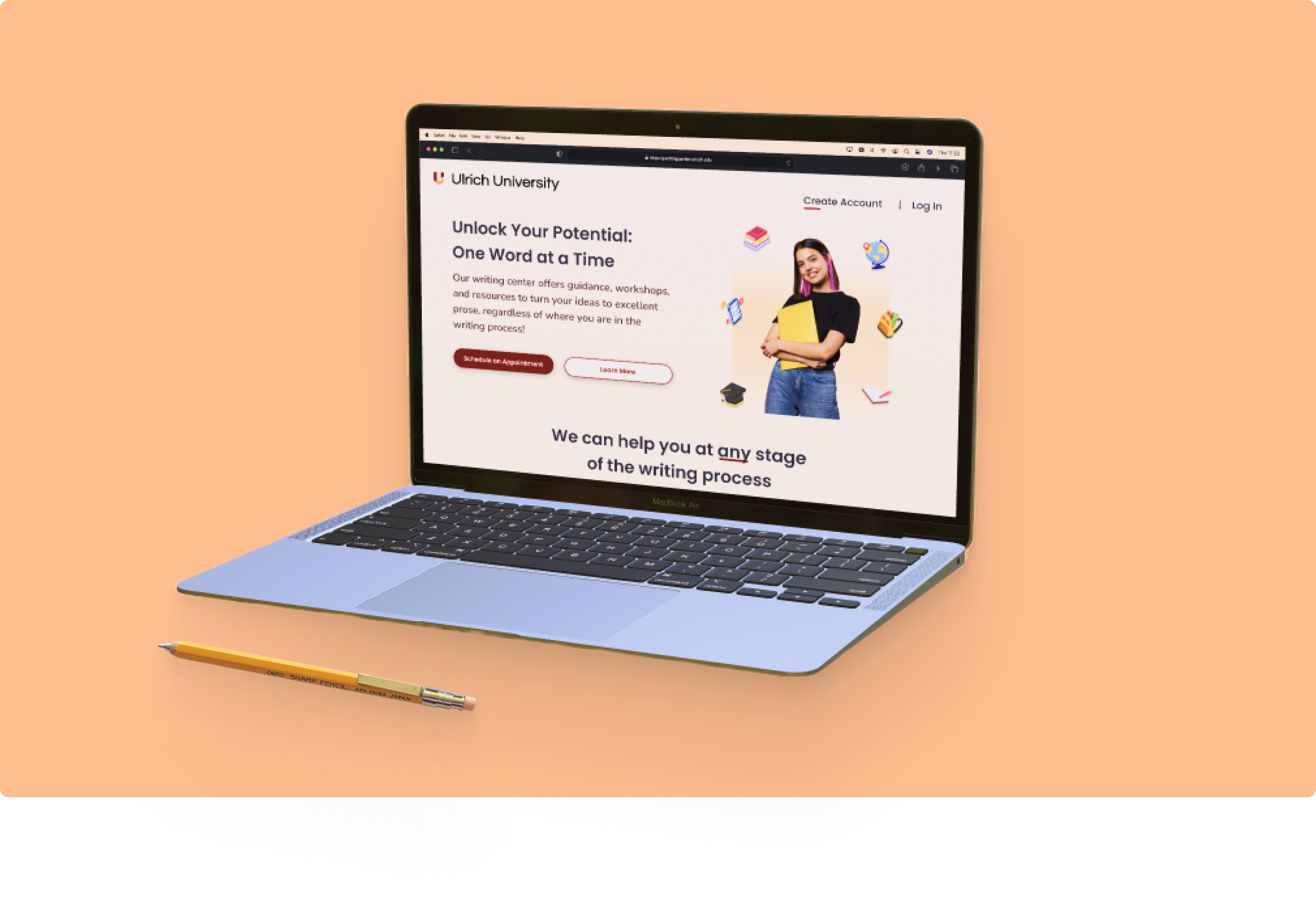
Ulrich U is a reimagining of the appointment-making process for Kennesaw State University's Writing Center
Info
Role:
Ideation, Branding, UI Design, UX Research
Team:
Sarah Subero
Duration:
1 month
Tools:
Figma, KSU Writing Center
Problem
The online appointment-making process for KSU's Writing Center is inefficient and unoptimized, leading to frequent mistakes in selecting the correct appointment type and confusion between online and in-person scheduling.
Outcome
I rectified the issues with the appointment-making process by creating a streamlined and user-friendly system. Additionally, I used this project as an opportunity to explore brand design by displaying this new system on a fictitious university's interface.
Understanding the Problem
What is the Problem? 🧠Two private surveys were conducted on KSU's appointment-making process: one for students, who rated the interface and their scheduling experience, and another for writing center employees, who evaluated the process's efficiency and highlighted the common issues they encountered once students booked appointments.Both groups expressed dissatisfaction with the process, describing it as "outdated" and "inefficient."
How Do I Fix the Problem? 🛠️The site's flawed design causes students to make errors, which then creates extra difficulties for employees. Streamlining the appointment-making process and preventing mistakes during booking will improve the process for everyone.
Competitive Analysis
Analyzing Similar Services 🔍I conducted a "competitor analysis" to see how other systems handled appointment scheduling; however, there was a problem.Most university writing centers are only accessible to their students, meaning I had to analyze scheduling tools like Acuity Scheduling or Calendly to gather data. From there, I assembled what features made for an effective scheduler.
Results 📊The purpose of the "competitive analysis" was not to create a superior scheduler, but rather to understand the design choices that made an effective scheduler. Filters, time slot pickers, and mini calendars were all features that appeared often in my research.
Ideation & Wireframing
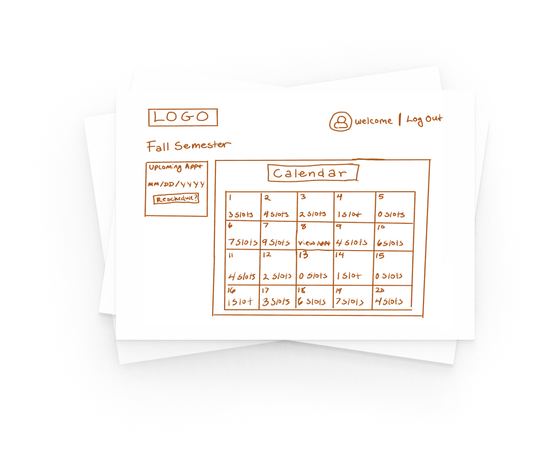
Turning Data Into Visible Design 🖌️Using the information I gathered from research, I began sketching concepts. I also created a list of essential features and the problems they addressed:
• User Profiles: Linking a student ID to create a profile that identifies a student as either a graduate or undergraduate would streamline the process of matching them with the appropriate tutor (graduate or undergraduate).• *Tutor Cards: Displays tutor availabilty, preventing students from requesting unavailable tutors• Pre-Populated Forms: Automatically fills in information from students' profiles, preventing entry of incorrect course codes or incorrect professor names.
*Note: For safety reasons, displaying a tutor's availability is an optional feature that can be toggled on/off at the tutor's discretion.
Brand Design
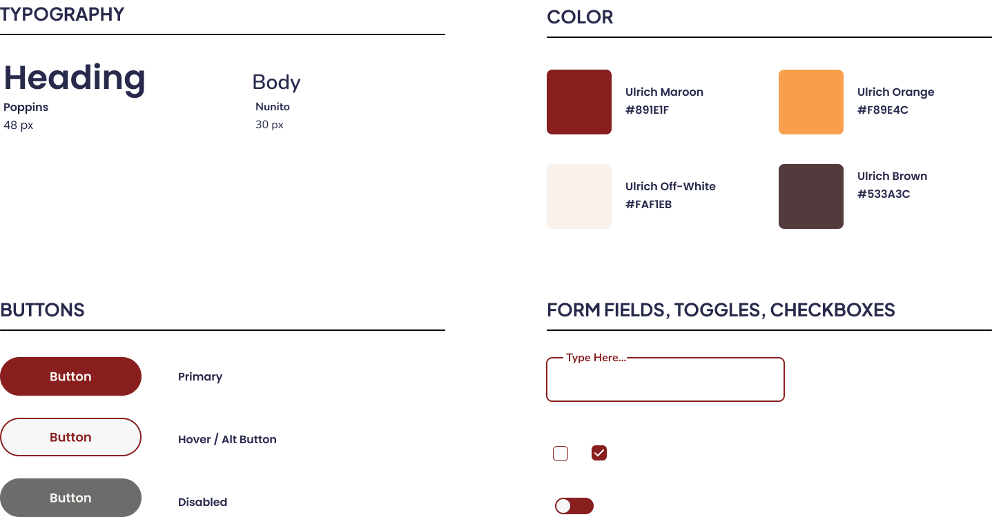
Creating a Design System 🎨Since this was a personal project, I saw it as an opportunity to showcase my design skills and develop a brand and design system from the ground up.Developing a design system for my prototype saved time, ensured I met accessibility guidelines, and kept my prototype consistent. This also allowed me to practice using Figma's newer features.

Note: Final version of the Ulrich University logo
Design System

Design Exploration
The homepage allows students to create an account, log in, and schedule an appointment.
A calendar view of the appointment scheduler displays the student's upcoming appointments and shows the number of available slots for each specific day.
Usability Testing
Was my Design Implemented?The prototype was a passion project designed to address many of the issues students and writing center employees were having with KSU's system.Since KSU relies on a third-party portal for scheduling appointments, implementing my designs isn't feasible at this time.
Testing the Prototype's EffectivenessEven though my prototype would not be adopted by KSU, I still conducted 8 usability tests (4 students, 4 employees) to gather feedback for future improvements.7 out of 8 participants reported that my version of the appointment-making processwas more intuitive, while all of the participants agreed that linking student IDs to their accounts would make it easier to match with the right professor and prevent inputting incorrect course codes.
Challenges & Lessons
Learned
Although this was a personal project meant to address some of the design flaws I witnessed as a writing assistant at KSU, it still came with many unique challenges.
1.
Avoiding BiasAs a KSU Writing Assistant, I found it challenging to avoid my own biases while designing this prototype. Many of the issues I identified with the site were based on my personal experiences. To ensure these issues weren't just a "me problem," I had my interview questions screened by unaffiliated third-parties such as professors, faculty, and KSU alumni.Additionally, I asked several Writing Assistants to ensure that my surveys contained no leading or open-ended questions.I was relieved to learn that the issues I had with the system were universal!
2.
Organization is KeyCreating a brand from scratch was a fun yet challenging experience, as I had only done it before as part of a team. In the past, I dove head-first into the design process, choosing colors, icons, and other design elements as I went along.This experience emphasized the importance of developing a design system to ensure consistency and quality from beginning to end.Sticking to the system took some getting used to at first, but it held me accountable while ensuring all elements of the final product worked together harmoniously.
Niblet
A small business' meal kit service for busy New York college students
Overview
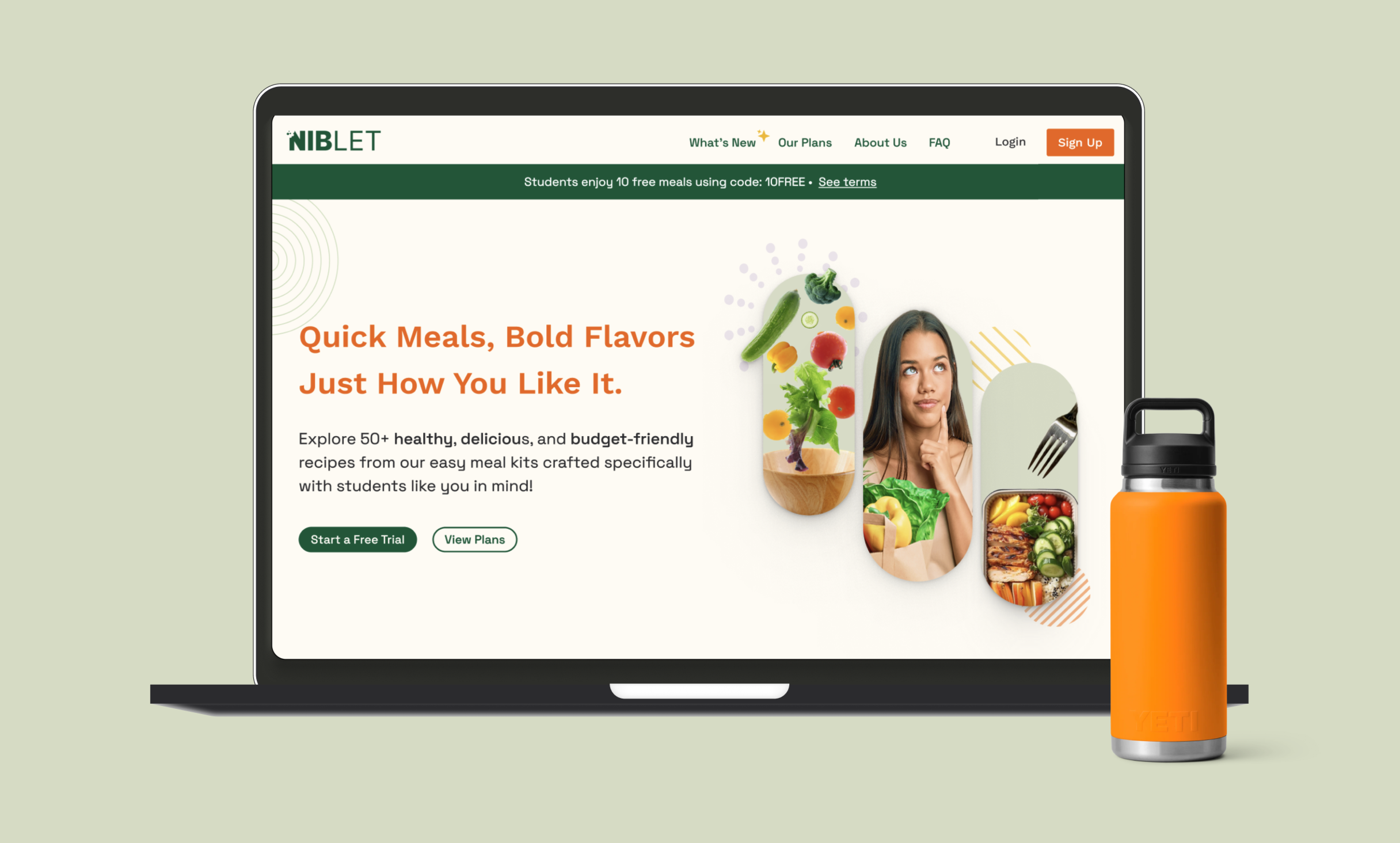
Niblet is a meal kit service for university students that promotes quick and healthy meals for a variety of dietary preferences
*Note: Due to the ongoing nature of the project, I am unable to showcase the full prototype at this time.
Info
Role:
Branding, UX Writing, UI Design
Team:
Sarah Subero, Solène Badillo, Jennifer Mitchell
Duration:
1.5 Months+ (Ongoing)
Tools:
Figma, Mural
Problem
Niblet has 55 different recipes (and counting), but clients are only utilizing around 33% of them. What factors are contributing to this limited engagement, and how can we encourage clients to explore a broader selection?Additionally, how can we create a visually-appealing redesign of Niblet's site to satisfy the users and business owners?
Outcome
We launched a site redesign that incorporated several avenues for users to easily discover the site's lesser known recipes and find any recipe on the site more quickly and efficiently.
Understanding the Problem
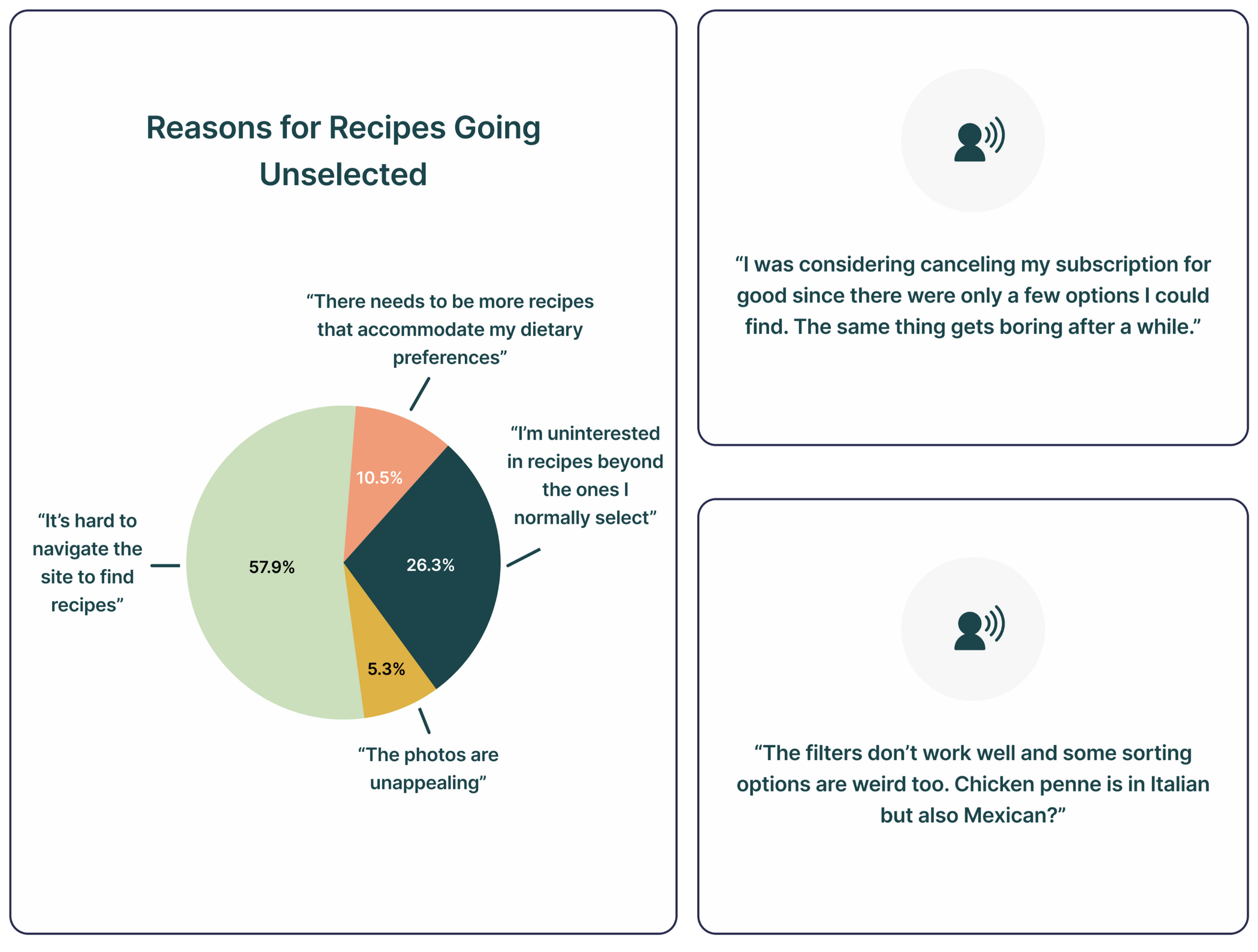
Using Survey Findings to Find The Problem 🔍Our client provided us with site data and survey feedback, revealing that only 33% of the available recipes on Niblet's site were being regularly requested by users.According to the survey, most Niblet users found the site difficult and cumbersome due to a poorly designed interface. Some users cited inconsistent labeling for recipes and a complex navigational structure: meals were often miscategorized or not linked on the site at all.As a result, users struggled to explore the full range of recipes and tended to stick with the options that were most visible and easily accessible.
Brainstorming Solutions
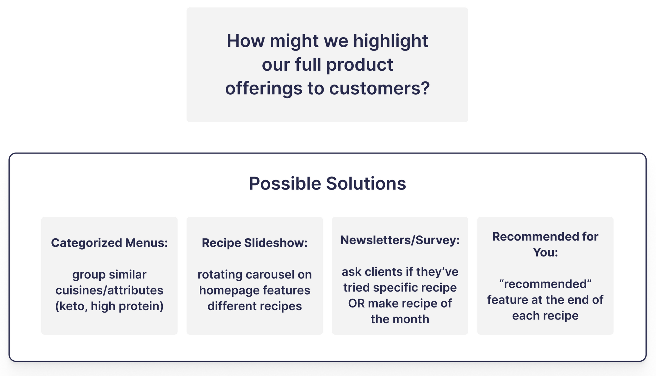
How Might We...? 💡My team began exploring solutions in the form of "how might we" (HMW) questions. These open-ended inquiries narrow down a problem while leaving room for a wide range of potential solutions.Some of our HMW questions included:
• How might we highlight the full product offerings to customers?• How might we fix the complex navigational structure that makes finding recipes difficult?• How might we rebuild and enhance the filtering options to help users quickly find recipes that meet their needs/preferences?
After drafting these questions we discussed possible solutions (shown to the right) with our client to decide which would be easiest to implement given their budget and other constraints.
Redesign Strategy
Start With a Creative Brief 📐As a means of addressing the site's navigational issues, our client requested a complete site overhaul and brand redesign. This site redesign would implement the solutions we proposed with our HMW questions.We began this process by drafting a creative brief to understand the style and voice our client hoped to convey as well as any other goals they wanted to achieve.These goals were depicted under the ROI (return on investment) section of our design brief (shown to the left).By the end of the meeting, our client's goals were clear, and we were given two different style options to consider:Style Option 1: Clean, modern, and vibrant
Style Option 2: Quirky, doodle-y, and fun
Brand Design
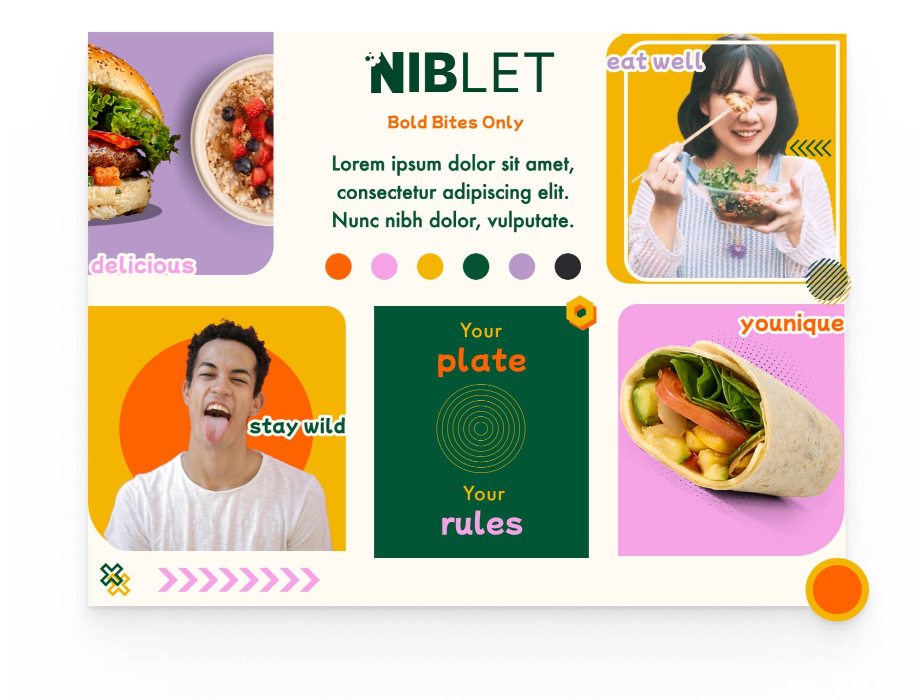
Creating a Moodboard 🖌️I was put in charge of making moodboards to find a middle-ground between the two styles options my team was given.I started by researching groceries, gyms, smoothie bars, and other establishments that championed health and wellness. As expected, shades of green and plant motifs were some of the most common design choices.
However, our client wanted to stand out in a positive and bold way. They wanted customers to feel like their products were made with them in mind.Instead of going completely against the grain, I chose a design with vibrant colors (beyond just green) and incorporated unique, asymmetrical shapes. This reinforced the brand's message of: “we're all about staying healthy, but we're doing it our way—full of fun, creativity, and without losing who we are.”
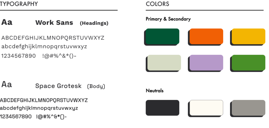
Building a Style Guide 🎨In addition to a moodboard, I created a style guide. While doing so, I preference-tested several san-serif fonts with our client. They selected Work Sans and Space Grotesk to represent the fun yet modern and bold style they wanted to convey to their customers.
Afterwards, we tested our color palettes through Web Content Accessibility Guidelines (WCAG) guidelines to ensure they met AA contrast criteria.
Wireframing
Turning Data Into Visible Design 📊With some of our design choices finalized, I began creating wireframes that showed how we would implement the solutions from our HMWs (one such design is shown to the right).According to survey feedback, most of Niblet's customers found the site difficult to navigate. To mitigate this, I researched the designs of competitors like Hello Fresh, EveryPlate, and BlueApron, and evaluated which features would improve the site's design the most.By incorporating features such as a search bar and well-organized meal categories, the site would feel familiar to users, minimizing navigation time and making it easier for them to explore all its features.
Mid-Fidelity Usability Testing
Usability Testing and Feedback 📝After finishing mid-fidelity wireframes, my team conducted usability tests with 10 of Niblet's customers (provided by our client).During this test, we gave our participants different tasks to complete which helped us gather feedback on the site's overall navigational structure.Some of the feedback we received for the Menu tab (the page where users could explore all the site's recipes) is featured to the left.
What We Discovered 🔍• Most users expected a filter feature to aid in their recipe search
• Several users believed the recipe tab should not be called a "Menu," as it sounded too much like a restaurant rather than a meal kit service
• A little over half of the users believed recipe recommendations displayed on the side of the page created unnecessary clutter. Some suggested this feature would be better placed at the bottom of a recipe page in a "if you liked that, try this next" section
• Contrary to what we believed, only two users were interested in a 'Seasonal Eats' section. Instead, they preferred a 'What's New' section for finding a new dish, not just ones that were in season
Implementing User Feedback
Creating a Better Prototype✨ While our first round of testing proved that the navigational structure of our site was sound, there were features and fixes that could be implemented to improve the overall experience for users.After discussing with our client, I modified and incoporated the feedback into a high-fidelity prototype that will undergo another round of usability tests as the project continues.
Improvements I Made:
• Renamed "Menu" tab to "Our Meals"• Added a dietary preference filter (e.g., keto, vegetarian) to help users quickly find recipes and discover new options within these categories*• Removed Recommended meals from the search page to reduce clutter• Renamed the 'Seasonal Eats' tab to 'What's New,' allowing users to find all new recipes easier.
*Note: Our client rejected the idea of including cuisine filters ('Italian,' 'Mexican,' etc.) as there were not enough recipes to justify such categories at this time.
Design Exploration
The homepage includes sign-up and login buttons, along with options to start a free trial and view all plans.
The "Our Meals" page displays all recipes for customers to browse, with a search bar, suggested categories, and filters to enhance the experience.
*Note: Due to confidentiality and the ongoing nature of the project, I am unable to showcase the full prototype at this time.
Challenges & Lessons
Learned
This case study highlights a snapshot of an ongoing redesign project, where continuous improvement is driven by ongoing user feedback.
1.
Balancing User Preferences and Business GoalsDuring this project, my team and I had to carefully balance user feedback with the desires and budgets of our client. Certain features were requested from our users, but they were not always viable given our client's preferences and constraints.Finding the optimum balance is an ongoing challenge as a designer, but it has pushed me to think outside the box and find new, creative methods so all parties are satisfied with the final product.
2.
Follow-up Questions Will Help You Solve ProblemsCreating a design that is feature-rich but not overwhelming proved to be a challenge for me during this project. However, I've learned that asking follow-up questions during usability testing is a great way to receive valuable design feedback on what users want to see and expect to see in a product they use.For example, during our first round of testing, many users mentioned that the 'Recommended Recipes' feature made the 'Our Meals' page feel too cluttered. When I asked follow-up questions on where the feature should be placed instead (if at all), half suggested moving the feature to the end of a recipe page in a "If you liked that, try this next" section. This suggestion indicates that users already have a clear expectation of how a similar site should function. Aligning the site with this familiar structure will make navigation smoother in the long run.We plan to implement and test this suggestion it in our next round of usability testing.
Six AI Use Cases
Six multidisciplinary use cases that utilize ChatGPT and the Ethical Wheel of Prompting + Rhetorical Prompting Method.
Overview
I utilized the Ethical Wheel of Prompting (EWP) and the Rhetorical Prompting Method (RPM) to iterate the prompt engineering process across six various use cases.These use cases focused on both creative and academic projects, including a war novella, a fantasy novel, and job-related questions
*Note: For aesthetic purposes, the conversations have been modified to fit with portfolio stylistics; however, unedited screenshot proof will be provided for each use case.
Info
Large Language Model(s):
ChatGPT & Perplexity
Rhetorical Tools:
Ethical Wheel of Prompting, Rhetorical Prompting Method
Duration:
Aug 2025 - Dec 2025
Use Case 1: Novella Outline Restructuring
Overview
I have previously written parts of a novella called The Sound of Little Dyings, but would like to rewrite/restructure the story and improve the character motivations and strengthen the plot points and improve upon the historical setting and how to connect the plotline to the story better.
Expected Outcome
- A novel template that provided x, y, z...What I wanted was a novel planning template.
Iteration 1
I intentionally gave ChatGPT very few parameters to see how it would go about suggesting how I should re-structure my novella and what kind of questions it would deem important to further assist me.I considered giving ChatGPT my novella's summary, but I was curious to know how it would advise me when given very little information.ChatGPT gave me a "step-by-step process."
I decided that I wanted a template I could use. So I reiterated on my prompt to ask for something better tailored to me and what I was hoping for. A template to better instruct me on how to proceed.I noticed that ChatGPT asked multiple times for more in-depth information in order to give more concrete information. Which I consider a good sign.
Iteration 2
I decided to just give ChatGPT what it requested (novella summary) and did not request a template at this point to see what additional information it would give me without me asking for something specific. I wanted to test what ChatGPT would give me for help.
I decided to just give ChatGPT what it requested (novella summary) and did not request a template at this point to see what additional information it would give me without me asking for something specific. I wanted to test what ChatGPT would give me for help.
Iteration 3
I asked for a template here.
Iteration 4
Use Case ?
Fantasy Novel Chapter-by-Chapter Worldbuilding & Structuring
Overview
The difference here is, I have been utilizing ChatGPT over several months on this novel.
Expected Outcome
- A novel template that provided x, y, z...
1.
Balancing User Preferences and Business GoalsDuring this project, my team and I had to carefully balance user feedback with the desires and budgets of our client. Certain features were requested from our users, but they were not always viable given our client's preferences and constraints.Finding the optimum balance is an ongoing challenge as a designer, but it has pushed me to think outside the box and find new, creative methods so all parties are satisfied with the final product.
2.
Follow-up Questions Will Help You Solve ProblemsCreating a design that is feature-rich but not overwhelming proved to be a challenge for me during this project. However, I've learned that asking follow-up questions during usability testing is a great way to receive valuable design feedback on what users want to see and expect to see in a product they use.For example, during our first round of testing, many users mentioned that the 'Recommended Recipes' feature made the 'Our Meals' page feel too cluttered. When I asked follow-up questions on where the feature should be placed instead (if at all), half suggested moving the feature to the end of a recipe page in a "If you liked that, try this next" section. This suggestion indicates that users already have a clear expectation of how a similar site should function. Aligning the site with this familiar structure will make navigation smoother in the long run.We plan to implement and test this suggestion it in our next round of usability testing.

Get to know me ✌🏽
📚 My journey into UX began at 12 years old when I started learning HTML & CSS to build webpages to share my stories with friends. This sparked a passion for design that led me to pursue my Bachelor's in Interactive Design at Kennesaw State University.💡 Writing follows me everywhere! At my university's writing center, I spent two years helping students on a plethora of writing projects, tailoring my approach to each student's specific needs. I've applied this same skill on my UX journey, where I focus on understanding specific user needs and assisting businesses in communicating their products effectively. I believe every good design tells a compelling story!💙 When I'm not designing, I'm either going on a run, working on my thriller novel, or playing Dungeons and Dragons.
copyright © 2024 - made by sarah subero✨


